Descriptive Statistics
Descriptive statistics summarize the main characteristics of a dataset or sample. They help us understand data by describing its frequency, center, spread, and overall distribution.
Frequencies and Frequency Tables
-
The frequency of a value or category is the number of times it appears in a dataset. For example, if 3 people report having 1 sibling, the frequency of "1 sibling" is 3.
-
The relative frequency is the proportion of observations belonging to a particular value or category:
Relative frequency may also be expressed as a percentage.
- The cumulative relative frequency is the sum of the relative frequencies up to and including a particular value:
Cumulative relative frequencies are meaningful only when the values or categories have a natural ordering. They generally do not make sense for unordered categorical data such as colors or countries.
Example: List of People and Their Sibling Count
Consider a dataset containing people and their numbers of siblings:
- Alice - 2 siblings
- Bob - 0 siblings
- Charlie - 1 sibling
- Dana - 3 siblings
- Elliot - 1 sibling
- Fatima - 2 siblings
- George - 0 siblings
- Hina - 4 siblings
- Ivan - 1 sibling
- Julia - 2 siblings
The data can be summarized with a frequency table:
| Number of Siblings | Frequency | Relative Frequency | Cumulative Relative Frequency |
|---|---|---|---|
| 0 | 2 | 20% | 20% |
| 1 | 3 | 30% | 50% |
| 2 | 3 | 30% | 80% |
| 3 | 1 | 10% | 90% |
| 4 | 1 | 10% | 100% |
Explanation:
- Number of Siblings lists the observed values.
- Frequency shows how many people have each number of siblings.
- Relative Frequency gives the proportion of observations in each group.
For example:
For 0 siblings:
- Cumulative Relative Frequency gives the percentage of observations at or below a particular value. For example, 50% of the people have 1 or fewer siblings.
Continuous data
Continuous variables can take any value within a range. Height, time, and temperature are common examples.
Although recorded measurements have finite precision, a continuous variable is modeled as being able to take any value in an interval. Listing the frequency of every exact observed value is therefore often not very informative.
Instead, continuous observations are commonly grouped into intervals, or bins, and the number of observations in each interval is counted.
Example: Height Measurements of a Group of People
I. Raw Data (Continuous):
Consider the following height measurements, in centimeters:
II. Grouping the Data into Intervals:
To avoid ambiguity at interval boundaries, we can use half-open intervals:
- $165 \leq x < 168$
- $168 \leq x < 171$
- $171 \leq x < 174$
- $174 \leq x < 177$
This means, for example, that a height of exactly 168 cm belongs to the second interval rather than the first.
III. Frequency Distribution Table:
| Height Range (cm) | Frequency |
|---|---|
| $165 \leq x < 168$ | 3 |
| $168 \leq x < 171$ | 3 |
| $171 \leq x < 174$ | 3 |
| $174 \leq x < 177$ | 1 |
The frequencies add to 10, matching the number of observations in the original dataset.
- Height Range identifies the interval used to group observations.
- Frequency shows how many measurements fall into each interval.
The choice of bin boundaries and widths affects the appearance of a grouped distribution, so they should be chosen and reported clearly.
Visualization
A histogram provides a visual representation of the distribution of continuous numerical data. The horizontal axis contains intervals of values, while the vertical axis shows their frequencies or relative frequencies.
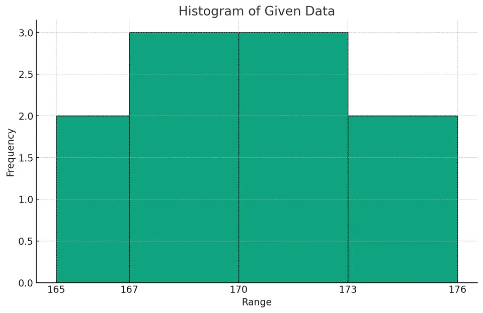
A histogram can help reveal features such as concentration, spread, skewness, gaps, and possible multiple peaks.
When constructing a histogram, the bin boundaries used in the plot should match those used in the corresponding frequency table.
Measures of Central Tendency
Measures of central tendency describe the center or typical value of a dataset. Different measures are useful in different situations.
- The arithmetic mean of a sample is the sum of its values divided by the number of observations:
The mean uses every observation and is often a useful measure of center for roughly symmetric data without influential outliers.
- The weighted mean gives different observations different levels of influence:
where $w_i$ is the weight assigned to observation $x_i$.
- The geometric mean is useful for multiplicative quantities such as growth factors, ratios, and some rates:
For the standard real-valued definition, the observations should be positive.
For positive data, the geometric mean is less than or equal to the arithmetic mean, with equality when all observations are equal.
-
The median is the middle value after the observations are ordered. If the dataset contains an even number of observations, the median is usually defined as the mean of the two middle values.
-
The mode is the most frequently occurring value. A dataset may have one mode, multiple modes, or no unique mode.
Example
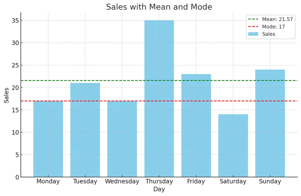
Consider the number of sales per day for a store during one week:
| Day | Sales |
|---|---|
| Monday | 17 |
| Tuesday | 21 |
| Wednesday | 17 |
| Thursday | 35 |
| Friday | 23 |
| Saturday | 14 |
| Sunday | 24 |
We can summarize the center of the data using the mean, median, and mode.
Mean
The arithmetic mean is:
Median
First, sort the values:
| Sales |
|---|
| 14 |
| 17 |
| 17 |
| 21 |
| 23 |
| 24 |
| 35 |
There are seven observations, so the fourth value is the median:
Mode
The most frequently occurring value is 17:
| Sales |
|---|
| 14 |
| 17 |
| 17 |
| 21 |
| 23 |
| 24 |
| 35 |
Therefore:
These measures describe the center in different ways. The relatively large value of 35 pulls the mean upward, while the median is less affected by it.
Choosing Between Mean and Median
The choice between the mean and median depends on what we want to describe.
-
Use the median to describe a typical value when the distribution is strongly skewed or contains influential outliers. The median depends mainly on the ordering of the observations and is therefore resistant to extreme values.
-
Use the mean when the arithmetic average itself is the quantity of interest. Because every observation contributes to the calculation, the mean reflects the total amount distributed across all observations.
-
Be cautious when interpreting the mean as a "typical" value in a strongly skewed distribution. In such cases, the mean and median answer different questions.
Neither measure is automatically more accurate. The appropriate choice depends on the purpose of the summary.
Example 1: Evaluating Salaries in a Tech Company
Alice is researching the salaries of graphic designers at a technology company. A few senior designers earn substantially more than most employees.
If Alice wants to know what a typical designer earns, the median is generally more informative because a few very high salaries can pull the mean upward.
If she were instead interested in the company's average salary cost per designer, the mean could be the relevant measure.
Example 2: Reporting Average Customer Spending in a Bookstore
Tom manages a small bookstore. Most customers spend around $20, but occasionally a customer spends more than $500.
If Tom wants to describe the spending of a typical customer, the median is useful because it is less affected by unusually large purchases.
However, if Tom needs the arithmetic average spending per customer for revenue calculations, he should use the mean:
The mean and median are not competing versions of the same statistic; they summarize different aspects of the distribution.
Measures of Dispersion
Measures of dispersion describe how spread out the observations are.
- The range is the difference between the maximum and minimum values:
It is simple to calculate but depends entirely on the two most extreme observations.
- The interquartile range (IQR) measures the spread of the middle 50% of the data:
Because it ignores the most extreme quarters of the data, the IQR is relatively resistant to outliers.
- Variance measures average squared deviation from the mean.
For a population of size $N$:
For a sample of size $n$, the usual sample variance is:
The denominator $n-1$ is used when estimating population variance from a sample.
- The standard deviation is the square root of the variance.
For a population:
For a sample:
Unlike variance, standard deviation is expressed in the same units as the original variable.
Both variance and standard deviation are sensitive to extreme values because deviations from the mean are squared.
Example: Comparing Athletic Performances
Suppose Chloe swims the 100 m freestyle in 53 seconds, while Liam completes a marathon in 2 hours and 55 minutes.
Because the events use different scales, their raw times cannot be compared directly. We can instead standardize each performance relative to the typical performance in its event.
Given Data:
I. For the 100 m freestyle:
- Mean time: $\mu=60$ seconds
- Standard deviation: $\sigma=4$ seconds
II. For the marathon:
- Mean time: $\mu=4$ hours $=240$ minutes
- Standard deviation: $\sigma=30$ minutes
Analysis:
I. Chloe's Performance:
Chloe's standardized score is:
Her time is 1.75 standard deviations below the mean. Because lower times represent better performance, this means she is 1.75 standard deviations faster than average.
II. Liam's Performance:
Liam's time is:
His standardized score is:
Liam's time is therefore about 2.17 standard deviations below the mean.
Relative to their respective reference distributions, Liam's performance is farther from the average in the favorable direction.
This comparison assumes that the supplied means and standard deviations are meaningful reference values for the athletes being compared.
Understanding Variance
Variability is a common feature of real data, but it can arise for different reasons.
For example, observations may differ because of:
- genuine differences among individuals or objects,
- natural random variation,
- measurement error,
- changes in experimental conditions,
- sampling variation.
Variance summarizes the amount of variability in numerical observations. It does not, by itself, identify the cause of that variability.
Repeated measurements can sometimes be identical, especially when measurements are discrete or rounded, so variation should not be interpreted as something that must appear in every repeated observation.
Example
Continuing with the store sales dataset:
| Day | Sales |
|---|---|
| Monday | 17 |
| Tuesday | 21 |
| Wednesday | 17 |
| Thursday | 35 |
| Friday | 23 |
| Saturday | 14 |
| Sunday | 24 |
We can summarize its dispersion using the range, variance, and standard deviation.
Range
The maximum value is 35 and the minimum is 14:
Variance
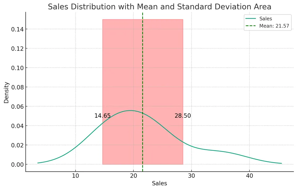
The mean is:
Suppose these seven days are treated as the entire population of interest. The population variance is then:
If these seven days were instead treated as a sample from a larger population of possible days, the usual sample variance would use $n-1=6$ in the denominator:
The distinction depends on whether the observed data are being described as the complete population of interest or used to estimate the variability of a larger population.
Standard Deviation
For the population interpretation:
For the sample interpretation:
The range, variance, and standard deviation describe spread in different ways. The range depends only on the smallest and largest observations, whereas variance and standard deviation use every observation.
However, all three can be affected substantially by extreme values. The IQR is generally more resistant to outliers.
Percentiles and Quartiles
Percentiles and quartiles describe the relative position of observations within an ordered dataset.
Unlike the range, they provide information about how values are distributed throughout the dataset rather than using only the minimum and maximum.
Percentiles
The $P$-th percentile is a value at or below which approximately $P\%$ of the observations lie.
For example:
- the 25th percentile marks roughly the lower quarter of the data,
- the 50th percentile is the median,
- the 75th percentile marks roughly the lower three quarters of the data.
For finite datasets, the exact definition of a percentile depends on the convention used for ranking and interpolation. Different statistical packages can therefore return slightly different percentile values for the same small dataset.
One common convention, used by many software implementations, assigns the one-based position
If $r$ is not an integer, linear interpolation is performed between the neighboring observations.
Example: Exam Scores
Consider:
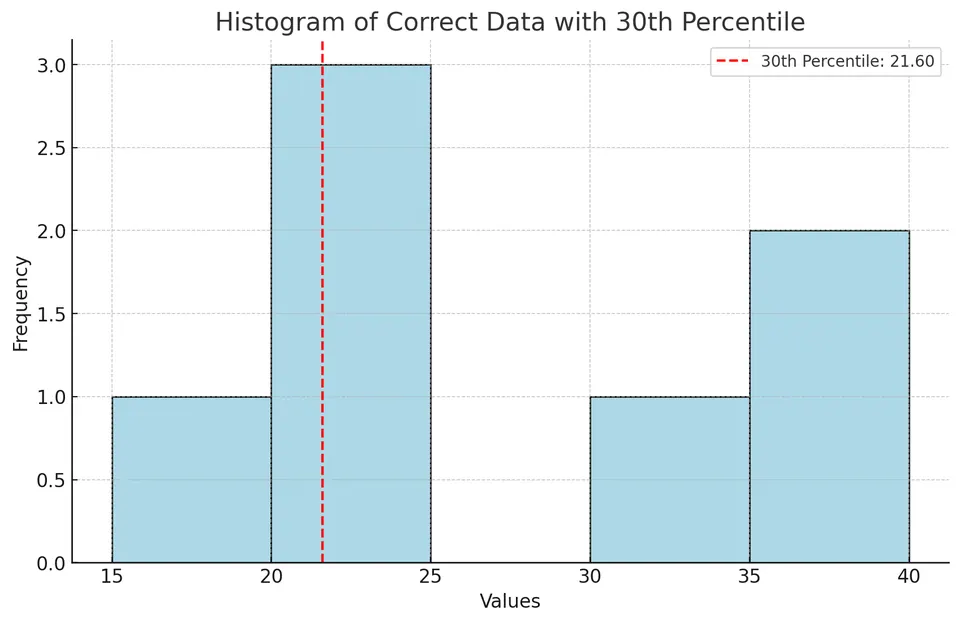
We want to calculate the 30th percentile.
Step 1: Sort the Dataset
There are:
observations.
Step 2: Calculate the Rank Position for the 30th Percentile
Using:
we obtain:
The 30th percentile therefore lies 80% of the way between the second and third sorted observations.
Those values are:
Step 3: Interpolation
so:
Under this percentile convention, the 30th percentile is therefore approximately:
Another valid percentile convention may produce a slightly different value. The important point is to use the same convention consistently when comparing results.
Quartiles
Quartiles are three percentile thresholds that divide an ordered dataset into four regions:
- First Quartile: $Q_1$, the 25th percentile
- Second Quartile: $Q_2$, the 50th percentile or median
- Third Quartile: $Q_3$, the 75th percentile
The interquartile range is:
As with percentiles in general, quartile values can vary slightly depending on the interpolation convention.
Example: Exam Scores
Consider the same sorted dataset:
with:
We use the same percentile position rule as above:
First Quartile (Q1)
For $P=25$:
The first quartile lies halfway between the second and third observations:
Second Quartile (Q2)
For $P=50$:
Therefore:
Third Quartile (Q3)
For $P=75$:
The third quartile lies halfway between the fifth and sixth observations:
Thus:
The interquartile range is:
Visualization
A boxplot summarizes the distribution using the median, quartiles, and whiskers:
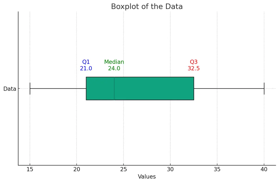
For this dataset:
- The first quartile, $Q_1$, is 21.
- The median, $Q_2$, is 24.
- The third quartile, $Q_3$, is 32.5.
- The interquartile range is $32.5-21=11.5$.
- The minimum observed value is 15.
- The maximum observed value is 40.
A common boxplot convention extends the whiskers to the most extreme observations still within $1.5\,\mathrm{IQR}$ of the quartiles and plots observations beyond those limits individually as potential outliers.
For this dataset:
and:
All observations lie within these limits, so there are no observations flagged as outliers under the usual $1.5\,\mathrm{IQR}$ rule.
The upper half of the data is somewhat more spread out than the lower half, but with only seven observations it is better not to make a strong claim about the distribution's skewness from the boxplot alone.